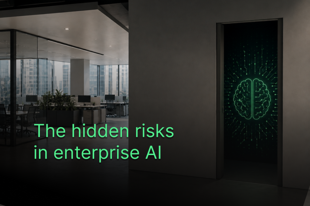
Ultimate Guide To Crafting Cutting-Edge Dark Mode Designs In 2024

Ultimate Guide To Crafting Cutting-Edge Dark Mode Designs In 2024

A recent study revealed that approximately 60 percent of users today favor dark mode design on their devices, which was once a niche feature. Dark mode enhances the visual appeal of the website or application and amplifies the user experience. In today’s world, companies strive to differentiate themselves by catering to customers’ preferences, and dark mode can play a significant role.

But designing dark mode isn’t just about flipping a switch. It requires careful thought and consideration to ensure optimal usability and aesthetics. From selecting appropriate color schemes and adjusting typography to handling images and customizing UI elements, there’s much to cover in mastering the art of dark mode design. This blog will look at the most recent trends, best practices, and concerns related to the dark mode. We will examine how it can help you stay ahead of the curve. So, let’s dive in and discover dark mode like a pro in 2024!

What Is Dark Mode Design?

Dark mode design refers to a user interface (UI) style where the primary background color is dark, typically black or shades of grey, instead of the traditional white background. Dark mode reverses the conventional light-themed UI that has existed for many years. Initially, it was used in early computing with monochrome monitors to reduce power consumption and heat generation.

Also Read: Why Professional UI UX Design Services Are Essential For Your Business?

However, dark mode has become more popular as mobile devices have increased. It helps extend battery life and makes it simple for people to see objects at night. As a result, prominent companies have embraced dark mode design, allowing users to switch between light and dark themes to suit various usage contexts and preferences. Additionally, dark mode design offers a sleek and sophisticated aesthetic, highlighting key elements and colors.

Why Should You Go For Dark Mode Design?

As explained below, there are several advantages to dark mode design for you and your users. The following points justify the decision to have a dark theme option on your website or application:

Reduces Eye Strain

a) Dark mode, particularly in low light, reduces eye strain and tiredness.

b) It prevents insomnia by decreasing the quantity of blue light that the screen emits and aids in preserving the body’s normal circadian rhythm.

c) It also lessens the contrast between the screen and the environment, reducing headaches and irritated eyes.

Saves Battery Life

a) The dark mode design extends battery life, particularly on computers and smartphones with OLED or AMOLED screens.

b) Since these screens only illuminate necessary pixels while turning off the rest, they help save power and extend battery life.

c) According to Google, dark mode on Android smartphones can extend battery life by up to 60%.

Improves Visibility

a) Dark mode enhances visibility and clarity in low-light environments such as movie theaters or dimly lit rooms.

b) By reducing screen brightness and glare, Dark Mode can improve readability.

c) It also creates a higher contrast between text and background, making content more accessible to read.

Also Read: Evolution of UI/UX Design in the Metaverse and NFTs

Enhances Aesthetics

a) Dark mode design elevates the aesthetics and ambiance of your website or app, reinforcing your brand identity.

b) It lends your product a sleek and sophisticated appearance, evoking emotions like mystery, elegance, power, or luxury.

c) Important colors and features on your interface stand out more when you choose the dark mode design.

Increases User Satisfaction

a) Providing dark mode design gives users more flexibility over their experience, which boosts user satisfaction and loyalty.

b) Users like switching between light and dark themes based on their tastes or circumstances.

c) Users view products with a dark theme choice as more inventive and trendy.

Best Practices For Dark Mode Design

Choosing Color Schemes And Contrast Ratios

a) Contrast Ratios: To make reading easier, ensure sufficient contrast between the backdrop and text colors. Use resources like the WCAG contrast ratio calculator to ensure your colors adhere to accessibility guidelines to ensure your colors adhere to accessibility guidelines. For standard type, try to get at least a 4.5:1 ratio; aim for a 3:1 ratio for enormous text.

b) Subdued Color Palette: Use muted and deeper tones to prevent eye strain in dark mode.

c) Accents & Highlights: Using contrasting accent colors judiciously to draw attention to critical details and preserve coherence.

Adjusting Typography And Text Styles

a) Font Color: To maintain legibility without too much contrast, use lighter text tones in dark mode, such as light gray or white.

b) Font Size: To improve legibility in dark mode, enlarge the font.

c) Font Weight: Consider using a bolder typeface to help the words stand out against the dark background.

Managing Images And Media

a) Image Adjustment: Darken images slightly to blend with the dark background for a cohesive look.

b) Background Images: Ensure background images work well in light and dark modes or use dynamic images that adapt to the mode.

c) Icons and Graphics: Make sure your icons and graphics have adequate contrast and, if necessary, use lighter versions to make them visible in dark mode.

Customizing UI Elements

a) Buttons and Links: Use different colors for buttons and links to promote interaction and make them stand out.

b) Forms and Input Fields: Style form elements with subtle backgrounds and contrasting borders for visibility in dark mode.

c) Navigation & Menus: To make active items easily identified, use well-defined icons and clear, readable text in navigation menus.

Also Read: UI UX Trends in 2024

How To Design For Dark Mode?

Designing for opacity requires more than a simple toggle. There are obstacles to go past. Here are some pointers for efficient design:

Limit Pure Black

Avoid using pure black (#000000) excessively. It can create harsh contrast and cause issues on OLED or AMOLED screens. Instead, opt for dark grey or tinted black for backgrounds, reserving pure black for accents.

Adjust Color Palette

Not all colors work well in dark mode. Adjust saturation, brightness, or opacity to ensure appropriate colors. Red may appear too intense, while green might lose its meaning. Adapt your color palette accordingly.

Ensure Adequate Contrast

Good contrast is essential for accessibility and clarity. To ensure that text and UI elements have adequate contrast, use tools such as WebAIM’s Contrast Checker. For text, try to keep the ratio at least 4.5:1; for significant UI elements, aim for 3:1.

Test in Various Environments

Dark mode appearance can vary based on device, screen type, browser, OS, lighting, and user preference. Test your design in different scenarios using tools like Chrome DevTools or Firefox Developer Tools to ensure consistency and readability.

Provide Switch Option

Not all users prefer dark mode. Provide a toggle option so people can select their preferred theme. If users have smartphones in dark mode, adhere to the system settings. Place the switch in a visible location, like the header, footer, or settings menu.

Also Read: Ultimate ChatGPT UX Cheat Sheet

How To Implement Dark Mode In Web Design?

As discussed below, creating dark mode for websites or applications involves different techniques.

CSS Tricks For Dark Mode

a) CSS Variables: Adjust CSS variables to set colors for light and dark modes. This allows you to switch between settings quickly.

b) Class Switching: Create different CSS classes for bright and dark modes. Switch between these classes to change the style based on the user’s preferences.

c) Prefers-Color-Scheme Media Query: This helps detect if the user prefers dark or light mode. You can adjust your design based on this preference.

Using Media Queries To Find Out What Users Want

a) Media queries help figure out if users like dark or light mode.

b) This code, for instance, targets gadgets that favor dark mode: @media (prefers-color-scheme: dark) {* Styles should be applied in dark mode */ }}

Switching Between Light And Dark Mode Automatically

a) Allow users to transition between the light and dark modes manually.

b) When they pick a mode, save their choice in cookies or local storage.

c) Use their choice to change the website’s look to match their preference.

Making Dark Mode Easy With CSS Tools

a) CSS frameworks like Bootstrap and Tailwind CSS have tools for dark mode.

b) They offer ready-made classes and components for dark mode.

c) Using these tools saves time and ensures your dark mode works well everywhere.

When picking a framework, choose one that fits your project and has good documentation and support from the community.

Also Read: Implementing Emotional UI/UX Design

Future Trends In Dark Mode Design

Dynamic Dark Mode

Dark mode will become more competent, adjusting in real-time based on lighting conditions for the best viewing experience.

AI-Driven Personalization

Artificial intelligence will tailor dark mode settings to individual preferences, making the experience more comfortable and satisfying.

Gradient and Textured Dark Themes

Expect dark mode themes to incorporate gradients and textures, adding depth and sophistication to the interface.

Minimalist Dark Interfaces

Designs will become more minimalist, focusing on clean lines and simplified elements to reduce distractions.

Seamless Cross-Platform Integration

Dark mode experiences will seamlessly transition across different devices and platforms, providing a consistent look and feel.

Enhanced Accessibility Features

Accessibility options will improve, offering all users customizable contrast settings and better readability.

Final Thoughts

Today, dark mode has become a prominent trend in web design. It provides visitors with a visually appealing and pleasant surfing experience. This guide has discussed various aspects of implementing dark mode, including the best practices and user experience.

Mastering dark mode design entails technical expertise, UX focus, and a keen aesthetic sense. Follow the best practices covered in this blog to build smooth, user-friendly experiences. Several UI mockup tools can help you easily imagine and improve dark mode designs. It’s like having a blueprint or a sketch that you can tweak and refine until you get it right.

About Us: Algoworks is a B2B IT firm providing end-to-end product development services. Operating chiefly from its California office, Algoworks is reputed for its partnership with Fortune 500 companies such as Amazon, Dell, Salesforce, and Microsoft. Algoworks is an expert in UI/UX Designs with experience catering to enterprises belonging to all domains. This includes: Brand Strategy, Product Design, UX Research, UI & Animation and Design Testing. For more information, contact us here.

The following two tabs change content below.
Nauman Ahmad

Nauman Ahmad

Head of Design & Marketing
Nauman Ahmad, Head of Design & Marketing has directed many targeted products to market success for a diverse client portfolio. In his 10+ years with Algoworks, Nauman has been well-known for experimenting with his unparalleled, bold & esoteric ideas; thinking break-throughs and executing unconventional methods. He has pioneered appreciable initiatives at the organization. He is passionate about exploring and experimenting with designs contributing to the development of brand definition. He holds in-depth experience in leading large cross-functional teams to craft authentic experiences for our clients, consistently meeting quality standards.
Nauman Ahmad

Latest posts by Nauman Ahmad (see all)

Nauman AhmadUltimate Guide To Crafting Cutting-Edge Dark Mode Designs In 2024