Implementing emotional UI/UX design – what could go wrong?
Emotions drive us. And it is no surprise that we find things that tingle our brains and make us feel a certain way. UI/UX designing is no different. Many times, we come across a digital product or a website that stands out. Was it because of the fonts and the colors used in it? Was it because the experience touched us? Can the designs touch us emotionally?
Emotional design has the power to impact the success of an app or a website in a huge way. But when you get to work on a project, you risk chances of losing your way to getting your product right, that you miss out on what should have really worked. But before we get into this, let us take a quick dive into understanding how emotional design works:
The 3 Stages of Emotional Design:
As told in Don Norman’s book ‘Emotional Design: Why We Love (Or Hate) Everyday Things’, here is the breakdown of emotional responses into three stages:
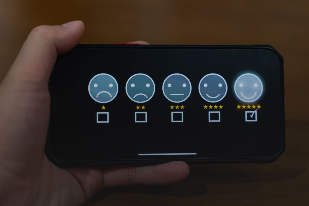
- Visceral: The most basic level of emotional response, visceral response means the first impression. A good UI design is when the design makes users feel good or excited right when they view the product.
- Behavioral: At this stage, the users subconsciously gauge the ease of navigating and finding the solutions they are looking for. Determining the easy usability and uncluttered user interface translates to positive emotions via a thoughtful UX take at design.
- Reflective: This is the highest cognitive level of response. Here, users consciously focus on the pros and cons of a product. It is at this level that the users form the overall impression of a design.
How Do You Use Emotional Design in UX/UI?
Here are a few ways to apply emotional design to your mobile application or website:
1. Use micro-gestures:
Can you sync your user’s rhythms properly? Can you sync your interface’s experience to tune with the user’s natural responses?
One of the best examples of micro-gestures is Apple’s screen shake feature, supplemented with a haptic response. When putting in the wrong password, the screen slightly shakes, indicating that the access is being refused.
Now getting the right product developed is of vital importance here. A slight extension of the shake feature on your screen can give you headaches. Too little? Can go unnoticed. Should you pulse the colors around when the error-shake feature occurs? If you do not get your maths aligned with biological responses, you can be in a mix!

Another example of micro-gesture is the Calm app’s (a breathing and meditation app) feature where a balloon inflates and deflates to guide users’ breathing rates.
Unless, of course, it could go adversely wrong if it is not designed under the supervision of a medical expert.
2. Make inconveniences tolerable:
Remember the dinosaur game in Google Chrome? It is the best example of making inconvenience a bit more tolerable. The game keeps users engaged when their internet connection is interrupted. This creates a positive experience out of a negative one.
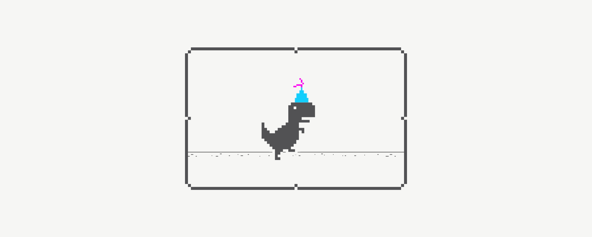
How can you leverage this trick? You can offer your users small rewards when they land on a 404 page, like offering them free access to one of your exclusive content pieces.
It’s about caring, isn’t it? And who doesn’t like to take T-Rex for a ride? Well done, Google!
An interesting takeaway here is however beautifully the code has been written to implement the idea – it’s clean, it’s fast, and it’s seamless. Now imagine you lost your power, and your dinosaur glitches, right before you were about to hit a high score. It would cause a burn over a burn. But when has it ever happened to any of us! Well done Google X2!
3. Personalize the experience:
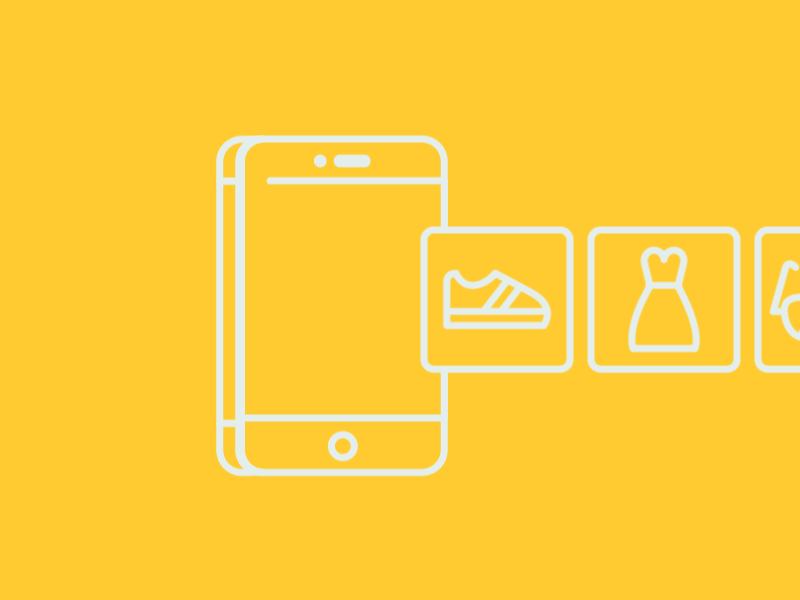
Some of the biggest video streaming platforms, like Netflix and Amazon, use personalization to create positive experiences for their users. They offer personalized recommendations based on the user’s browsing behavior and past engagement patterns.
Can it turn bad? Yes, if the personalization keeps people from exploring new stuff that they would have loved. Or if personalization was done at the cost of the privacy of users. We don’t need Big Brother watching us all the time and feeding us what they think should be fed to us, instead of what we wish to explore, right?
You get the idea!
Wrapping up…
In today’s world, almost anyone can bring together a team and implement various technologies to create functional and feature-rich digital products. The actual challenges now are to have a deep understanding of your user’s behavior and creating user journey maps to provide better services. Translating user behavior into an effective emotional design is not a piece of cake and requires experiences that are beyond any technology.
It is a realm where physics meets biology, digital meets technology, and all on a plane where maths meets our hearts and minds.
Creating an emotional design that is elegant, aesthetically pleasing, and authentic plays a vital role in delivering an ideal experience which, in turn, will lead to competitive advantage and growth. If you do your job for the ‘right’, you can find purpose in everything you do.