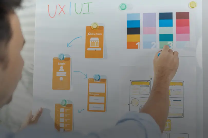
5 Psychological Principles for Better UX Design
UX Design and psychology are intimately connected. Does studying the human mind and behavior really help a UX designer? Are there laws and principles that can bolster your arsenal with ideas that can improve your performance?
“To be a great designer you need to look a little deeper into how people think and act.”
— Paul Boag
We’ve collated and simplified 5 psychological concepts that will help you improve the usability, attractiveness, and effectiveness of your designs to get you started.
If you’re new and want a quick overview of what a good UX design can actually do to your business, check out this video! However, in this blog, we are going to dive into some popular UX design principles with examples!
UX or User experience professionals are intended to respond to people’s requirements, identify their primary pain areas, and use design to solve their problems. This is why, to produce world-class products, you must first understand human behavior. Designing experiences becomes less of a gamble once you understand the fundamental principles of psychology. It will be easier for you to identify the areas for growth and generate ideas based on psychological theories.
Hick’s Law
Consider going to a restaurant with a menu of over 100 items. It will take significantly longer to read through all of the alternatives and make a selection than if the menu only contained 20 possibilities. According to Hick’s law, as the number of options offered increases, so does the time it takes for customers to make a selection.
Whether you realize it or not, what you consider to be “worth it” has an impact on the decisions you make. Before making a decision, you unconsciously calculate the costs and rewards. The cost-benefit analysis is the term for this.
Wherever possible, condense large lists and limit the number of possibilities.
There are two key takeaways for you from my point of view:
-
- They don’t need options:
Your application users love customization, but they‘ll be more than happy to work under constraints. Don’t give them options. Cut ‘em as many as you can. Give them few options and improve the usability of the provided features to the max.
Don’t believe me? Well then answer this – Do you really think Instagram could not let you segregate your posted media (all your cool pictures, food shots, videos, etc) so that you could arrange your stuff as per categories? But no – all your posts on your profile appear as a single album sorted by timeline. It is intentional, and it works. Just like Apple didn’t let you use a custom-designed keyboard for years – in spite of having the best development team at their disposal.
- They don’t need options:
- But they do have goals:
Visitors have a certain goal in mind. Remove unnecessary links, photos, texts, or buttons from pages so that visitors can easily find what they need and complete their tasks.
Wherever possible, condense large lists and limit the number of possibilities.
For example in the desktop version of Netflix, the data is segregated on the basis of popular categories, and the number of items has been restricted to a minimum by increasing the size of the media thumbnail – hitting two birds with one stone. It helps not adding a huge list of items under one category, and also helps users able to read the title of the media and relate to it with its image with ease. This helps Netflix empower its users with maximum productivity. But the interesting thing here is that Netflix has eliminated the choice of a lot of options for the user – yet it is a solution that works magic with its userbase.

Miller’s Law
This was first put forward by an American psychologist George A. Miller in his research paper, “The Magical Number Seven, Plus or Minus Two.”
According to Miller’s Law, the average person’s working memory can only hold roughly 7 (plus or minus 2) items of knowledge.
It’s a different matter that my memory can hold no more than 2! 🙂

This is a crucial point to keep in mind when we consider how we want to communicate with people on our websites and apps. So what can you do about it?
- Placing the right content at the right position on the interface you are designing matters a lot. You must learn how the average user’s eyes move on a mobile app display, web screen device, tablet screen, etc.
- Determine how much information to display to users at any one time (and what to cut out). Revise and revise again. The safest way to approach is to identify the ‘must-haves’ or the ‘uncompromisables’ and stick to improving that.
According to Miller’s Law, the average person’s working memory can only hold roughly 7 (plus or minus 2) items of knowledge.
Chunking is a handy approach for dealing with this restriction. When you have 20 items to show users and divide them into seven logical pieces, the chunks create new separate “items.” Instead of remembering 20 things (which according to Miller’s Law is impossible), they just have to recall 7.
But what if you are asked to design for a firm with 12 master categories, and each master category having 20+ child categories? What if you are also asked to find a solution to design their mobile application with all this data as well?
And what if they introduce a third level of the hierarchy? Take this as an assignment and discuss it in the comments!
Memory Limitations
After you‘ve left your house to attend yet another dose of those boring chores, do you doubt if you locked your door properly?
Or worse, were you really convinced you did lock the door, only to find out later the door wasn’t locked?
Is it your mind playing tricks on you? Are you getting forgetful? Is it a disease needing cure? Or is our memory that saved a piece of false information? Well, that last answer is usually true- human beings frequently generate false memories – our ideas, feelings, beliefs, and surrounding environment all influence how we store knowledge.
In this, they either remember things that did not happen or remember them differently than they actually were — studies suggest. That being the reason why creating designs based on the brain’s habit is vital, since they are simpler to remember because memory is malleable.
So what can you do?
- Respect the fact that your users’ time is precious, and they might not recall everything they see. Create designs with strategy. Reduce the ambiguities and avoid designs that can confuse them.
- We have a working memory capacity of 10-15 seconds and can only recollect three to four objects at a time. And in usual applications, one idea per space / per screen is all you must target to deliver.
The Psychology of Colors
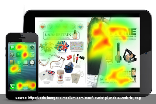
The science of how color influences human behavior is known as color psychology. Our ability to perceive color is a complicated process. To translate what we see in colored images, both the eyes and the brain work together. Many companies employ this translation as a marketing tool because it is subjectively related to feelings and thoughts.
According to studies, up to 80% of customers believe that color aids brand recognition. To enhance the efficiency of your design and evoke particular feelings associated with your brand, you should consider your target audience, purpose, and timing when picking colors for your website and branding.
However, it is also significant to make things appear pleasant. The more appealing a product is, the more usable it is and this phenomenon is known as the Aesthetic Usability Effect.
Colors can induce hunger, thirst or even sexual excitement.
Positive emotions and attractiveness are linked to increased quality, so if your users like what they see, you’ll see an increase in sales. People will readily ignore usability issues due to the appealing appearance.
Let’s take a look at the general characteristics of red and yellow color:
Red: energy, love, exciting, action, bold, passionate
Red-Bull is a great example of how a company’s branding has used red to emphasize how lively and energetic its product is.
![]()
Yellow: logical, optimistic, forward-thinking, confident, playful
Yellow boosts our brain capacities and makes us feel uplifted and cheerful. Because the color is the most obvious of all hues, it cannot be missed.
And yellow with red is what helps our mind focus on voids in you that were otherwise probably ignored. Propelled by the absence of select colors, when the mind identifies these voids, no matter how little they are, it tells the body to induce ‘hunger’, ‘thirst’, and ‘sexual excitement’ as well. Isn’t the lady – the epitome of a man’s desire – so close to the colors we have been talking about?
![]()
Mental Models
Mental models are established as a result of a person’s real-world experiences and expectations. People have a mental model of how to engage with items or systems that they use all of the time.

If your product’s design and functionalities don’t match the mental models, your users are likely to find it challenging to use at first.
Throughout their experiences, people anticipate the same navigation, interactions, and vocabulary. Users want global navigation to be at the top of the page, links to be blue and underlined, and the website’s logo to link to the home page.
For example, users already expect to be able to sign in to social media sites with a single click. A design like this one that gives the users the options they are habituated to ends up reducing the ‘learning curve’ for the users.

Now imagine you download a new app, and the app asks you to sign in using email and password. And it doesn’t have options to sign in via social accounts. Would you be excited about creating and memorizing yet another password on yet another app? Stats show the drop ratio at this screen just for this missing feature is above 45% and rising.
Any effective design may need to be updated from time to time, but the best thing about these principles is that they are timeless design solutions.
There is so much more to talk about on this topic. But the ink must dry, and the eyes must rest. Any challenges you have faced? Any idea that comes to your mind! Principles you might have created on your own! Do share! Have a great day creating stuff. Until we meet next!
Understanding psychological triggers becomes even more effective when paired with Atomic UX research, enabling teams to organize behavioral insights into actionable design improvements.