
UX is more than screens: designing for the unseen moments
Your checkout flow has a 68 percent abandonment rate. Users pause on the payment screen, hesitate, then disappear. The product manager blames the form. The developer wants fewer steps.
But that pause isn’t about layout. It’s a moment of doubt: trust, returns and commitment. Most traditional user experience design approaches focus on what’s visible: spacing, hierarchy, and polish. These elements help, but they don’t change how people feel while deciding.
This is where UX design services do their real work, shaping the experience beneath the surface so users feel confident enough to move forward.

Understanding the invisible emotional layer in UX design
The real experience of a product reveals itself in moments people don’t consciously notice. These aren’t decorative touches; they’re the small cues that turn anxiety into clarity and hesitation into action. Effective user experience design recognizes these critical touchpoints.
Voice and tone that matches the situation
We built an app for the largest roadside assistance brand in the U.S. and moments like these user experience design truly means. When someone is stuck on the side of the road at night with their family and a flat tire, tone isn’t a UX detail; it’s the experience. The interface needs fewer words, simple iconography and quick choices. Instead of long prompts, the user taps an image of a tire and answers a direct, empathetic question like What happened? Thoughtful user experience design guides them forward without adding to their stress.
Error messages that build trust
A decline message can either make someone feel at fault or clearly explain what went wrong. Stripe’s approach to user experience design gives context and guidance instead of dropping a cryptic error code. Same failure, different emotional effect; this is the power of intentional user experience design.
Loading states that reduce anxiety
Headspace demonstrates excellent user experience design by using short calming phrases during loading, which subtly reinforces their purpose. It turns a potentially anxious wait into a signal of care. Most apps throw a spinner and leave users alone with their imagination.
Transparency before vulnerable moments
When someone enters payment details or connects personal data, they’re exposing themselves. Calendly’s approach to user experience design makes it clear who can see your availability before you link your calendar. That tiny moment of clarity builds trust before any action is taken; a hallmark of superior user experience design.
Space to experiment without fear
Notion lets users restore deleted pages for 30 days. That simple safety net, a perfect example of thoughtful user experience design, encourages exploration. People engage more freely when they know they won’t be punished for a mistake.

Where traditional UX design falls short in addressing user emotions
Most design processes still ask only functional questions. Can the user complete the task? Is the flow efficient? These checks matter in user experience design, but they don’t capture what people feel as they move through a product.
Real users aren’t gliding through screens in perfect concentration. They’re distracted, multitasking, second-guessing or working under pressure. Designing only for the ideal path creates experiences that fall apart the moment real life enters the picture. You see this in Salesforce Service Cloud projects as well, where even a small bit of interface friction can slow agents down and quietly hurt onboarding, comfort and adoption.
Mapping emotional touchpoints
A helpful way to advance your user experience design is to chart not just what users do, but how they feel at each step. When you pay attention to the emotional shifts, the friction points become obvious.
First-time user anxiety
Empty screens can feel broken if they’re not handled thoughtfully in your user experience design. Slack’s “You’re all caught up” message sets a tone of progress rather than absence, which makes the product feel alive even before activity begins.
Decision paralysis
Irreversible actions demand clarity in user experience design. Users want to know what’s happening, what won’t change and how they can undo it. When that safety is built in, hesitation drops dramatically.
Vulnerable interactions
Any moment that involves money, personal data or public exposure requires extra care. Transparency doesn’t just inform. It calms.
Progress reinforces confidence
Telling a user “3 of 5 steps” feels more concrete than watching a vague bar crawl forward. It gives people a sense of control rather than passive waiting. This kind of emotional clarity matters in mobile app development services, where every hesitation shows up instantly in how the product feels.
Don’t overwhelm with choice
We fix a lot of eCommerce flows where the biggest issue is simply too many options. A screen might proudly show 32 home-insurance plans available in a user’s area. That may be accurate, but it’s also the fastest way to make someone close the app. People don’t want a catalog; they want clarity. Limiting choices to a few well-explained options helps them decide quickly and confidently.
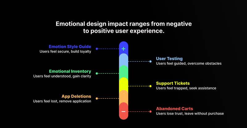
The business impact of emotional UX design on user engagement and conversions
The numbers you see in analytics are symptoms, not causes. Abandoned carts form when trust feels shaky. App deletions happen after users feel confused or blamed by the interface. Support tickets often show up when someone feels stuck, not because the system genuinely broke.
When you approach these metrics through the lens of emotional user experience design, solutions become clearer.

How to build emotional intelligence into your UX design process
You don’t have to overhaul your entire product to bring emotional awareness into your user experience design. A few intentional shifts go a long way:
Add emotional inventory to design reviews
Ask what users might be feeling when they land on a screen. What might worry them? What would help them feel certain? These questions anchor critiques in the user’s lived reality rather than just the interface.
Change your user testing questions
Move beyond “Was this easy?” and dig into reactions. What moments created stress? Where did the user slow down? Which interaction made them feel unsure or confused? What questions were they asking? These insights directly improve your user experience design.
Map emotional states next to the user flow
- Homepage → Product → Cart → Checkout → Confirmation
- Curious → Interested → Uncertain → Anxious → Relieved
Design with both tracks in mind. The emotional journey should feel as intentional as the navigational one.
Create an emotion style guide
Define how your user experience design handles mistakes, asks for sensitive information, and celebrates success. Consistency here builds predictability and makes your product feel safer.
Run empathy exercises with your team
Try completing onboarding on weak wifi. Recover from an error without help. Use the mobile version while in motion or with limited attention. These moments reveal the cracks that never show up in perfect prototypes.
Best practices for creating emotion-driven user experiences
Emotional user experience design isn’t about warm language or cheerful illustrations. It’s about understanding the mindset of the person on the other side of the screen and shaping the experience so they feel informed, supported and confident as they move through it.
We usually start by building user personas that capture each key user’s goals, frustrations and mental state at different moments in their journey. Those insights then guide future flows, helping us design for real people with real constraints.
When you map even a single journey through this lens, the blind spots in your user experience design become obvious. You see the moments where someone hesitates, loses clarity or feels stuck. And once you understand what people feel, not just what they click, your design decisions become sharper, faster and far more effective.
How Algoworks helps design emotion-driven UX experiences
If you’re trying to uncover what’s really behind your drop-offs, hesitation points and inconsistent conversion patterns, we can help you break it down. Algoworks builds digital experiences that don’t just look polished; they earn trust, reduce friction and move people confidently from intent to action.
If your product needs clearer emotional signals, tighter flows or experience-led optimization across web or mobile, our team can work with you to redesign the journey in a way that aligns with how users actually behave.
Contact us when you’re ready to make your product feel as reliable as it functions.
FAQs
Why does emotional design matter if my interface already works?
Functionality gets users through a task once. Emotional clarity brings them back. People remember how the experience made them feel, not just how it operated.
How do I identify emotional friction in my product?
Watch hesitation points. Ask users to think out loud as they move through the product. Notice where users slow down, re-read or backtrack. Those moments reveal uncertainty that flowcharts and heatmaps rarely surface.
Can emotional design improve conversions?
Yes. When users feel informed and safe, they complete actions faster and with less doubt. Trust directly influences purchase behavior, onboarding success and retention. We have seen numbers that prove this out definitively.
What’s the fastest place to start?
Rewrite error messages, improve loading feedback and clarify irreversible actions. These three touchpoints change user confidence immediately.
How do I present emotional findings to stakeholders?
Pair emotional observations with behavior metrics. For example: “Users abandoned at this step because they felt unsure about data visibility.” It connects feelings to outcomes leaders already track. User Personas that capture the user’s mindset, goals and current friction points are hugely helpful in ensuring that you design to address them.

