Designing websites for an AI-first user journey

Your website is no longer the place where the buying journey starts. Before they see your homepage, they have likely already asked an AI tool what your product does, how it compares to alternatives and roughly what it costs. Gartner predicts traditional search engine volume will drop 25% by 2026 as buyers shift this early research to AI chatbots and virtual agents (Gartner). That single number explains why so many websites still greet every visitor as a first-time researcher, when most have already done that research somewhere else.
Some of that research ends before a website is ever opened, in a zero-click answer with no visit at all. That’s a discovery problem and a different article. This one is about the visitor who does show up, already informed and what the website itself needs to do differently for them.
This is the real problem behind designing for an AI-first user journey. The website used to be step one in the buying process. Now it is often step four or five, and most sites are still built like step one.
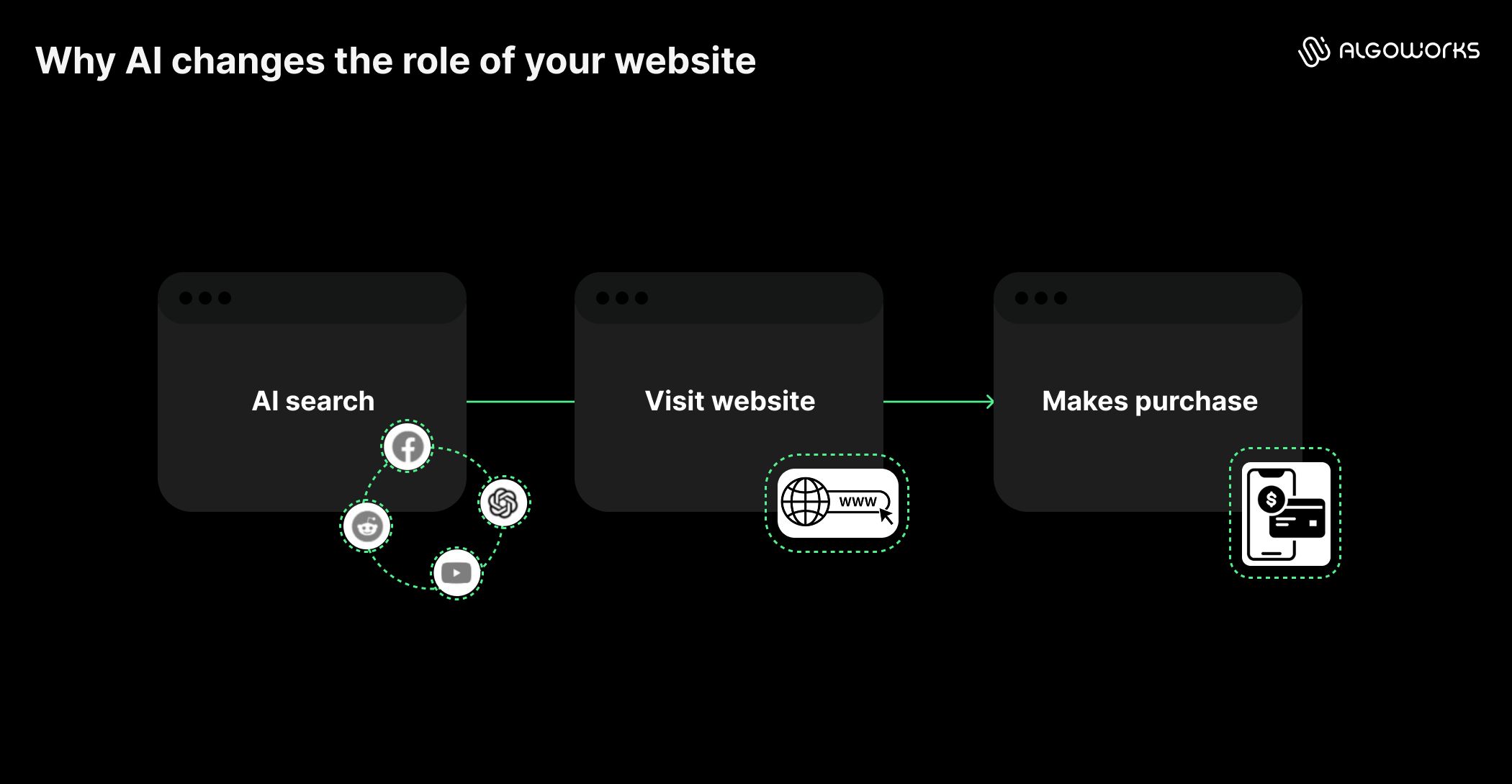
Why AI changes the role of your website
For years, websites were built around a sequence. A visitor would land, browse a few pages, gather information and slowly move toward a decision. That sequence made sense because the website was the primary place where understanding formed.
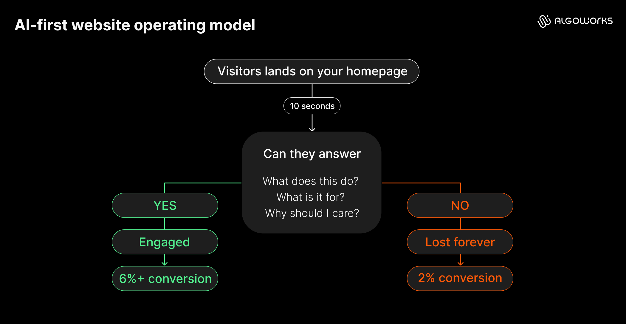
That is no longer true for most buyers. Discovery now happens inside AI conversations, often before the website is even opened. By the time someone reaches an enterprise software vendor’s site, they usually already know the core features, the rough pricing and the two or three competitors worth comparing. What they do not know is whether it fits their team’s budget, workflow and timeline.
That is the real shift. The website’s job moves from delivering information to closing a confidence gap. A buyer evaluating enterprise software is not looking for a features list. They are asking narrower questions:
- How hard is implementation?
- Will it work with our current systems?
- What happens after launch?
None of these are missing facts. They’re missing context. A site that explains the basics again wastes the one visit where it could answer implementation, integration and risk questions instead.
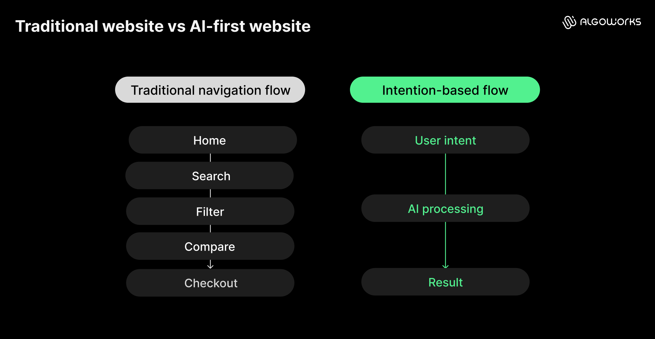
What should happen when someone arrives after using AI?
Once you accept that the confidence gap is the real job, the next question is what the site should actually do when that visitor shows up. Most navigation is still built for the old sequence. Products, solutions, pricing, a set of categories the visitor is supposed to browse until they find what they need. That structure assumes the visitor does not already know what they are looking for.
An AI-informed visitor usually does. Someone researching an online degree is not looking for a link labeled Admissions. They are trying to answer something specific:
- Can I do this while working full time?
- Does this fit my career goals?
- Is it worth the investment?
Those answers sit scattered today across a program page, a cost calculator and a testimonials section. The fix isn’t more pages. It’s organizing content around decisions instead of pages. Pull cost, timeline, fit and proof into one view built around the visitor’s question.
Enterprise software works the same way. A question about implementation is really three questions: effort, hidden enterprise AI risks and cost. Good design pulls that information into one place instead of sending visitors across the website looking for answers.
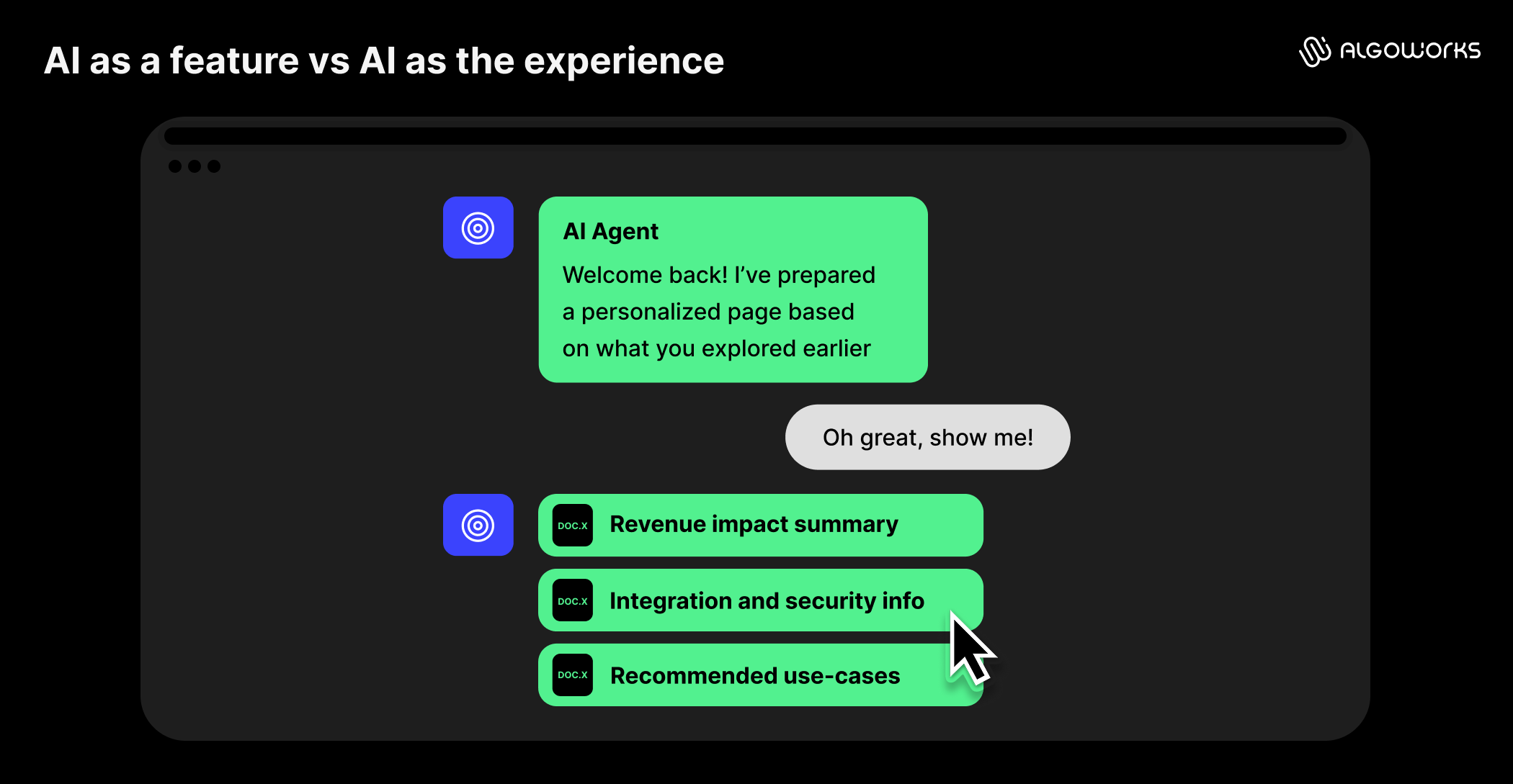
Should AI become another feature or the experience itself?
Worrying about the design part is only half of the problem. The other half is how the visitor interacts with it and most companies answer that by adding a chatbot to an otherwise unchanged website. Same navigation, same pages, same content, plus a chat icon in the corner. The AI becomes a side feature bolted onto an experience that was never rebuilt around it.
A more effective approach treats the conversation as the interface, not an addition to it. A recent use case was built exactly like this for a higher education client. An AI assistant sits on one side of the homepage and the conversation with it actively reshapes the content on the other side as it develops. Instead of layering a chat window onto a static page, the conversation becomes the interface. The conversation itself is the navigation and what the visitor sees updates based on what they have actually said, not a menu they have to browse on their own.
As the exchange continues, the tool builds a visible plan the visitor can return to: program options, estimated cost, a rough timeline, instead of losing all of that the moment they close a scrolling chat window. That is the difference between AI as a feature and AI as the experience. A feature answers a question and disappears. An experience carries what it learns forward and uses it to shape everything that comes next.
Why isn’t answering questions enough anymore?
Most agentic AI in enterprises still treats each question as a fresh transaction, disconnected from the one before it. Website experiences often inherit the same limitations. Decisions do not actually work that way. A question about tuition naturally leads to a question about financial aid. A question about product features leads to timelines, integrations and readiness. Each answer changes what the visitor needs to know next.
An experience that resets after every question forces the visitor to keep re-establishing context, which is exactly the friction an AI-first site is supposed to remove. A better approach lets context accumulate naturally. Each response should narrow the visitor’s options and build directly on what came before it, so that by the fifth exchange, the visitor is closer to a decision. What people leave with matters more than how many questions they got through: a shortlist, a clear recommendation or a plan they can act on.
Where should AI hand the experience back to people?
A shortlist or a plan is still not the finish line, though. Even a well-built AI experience has a limit and buyers know it. Gartner’s 2026 research found that 69% of B2B buyers still turn to a person to validate AI-generated insights before deciding (Gartner, May 2026). That statistic highlights a design requirement many teams overlook. The AI should not be built to replace the human handoff. It should be built to make that handoff easier to want.
The higher education example proves this. The team expected the AI assistant to reduce advisor contact, since it answered questions itself. However, the opposite happened. Visitors who used the assistant were more likely to contact an advisor. Once the AI narrowed the options and built out a plan, talking to a person felt like the next step, not a cold call. That is the handoff working as intended. AI builds the confidence and a person closes it.
Do these principles apply beyond customer websites?
None of this is limited to public-facing marketing sites. It applies just as directly to internal tools, the software employees use to do their jobs. The stakes are even higher with internal tools because poor experiences limit AI for operational efficiency and lead to poor business decisions, not just lost visitors.
For instance, a manufacturing client’s engineers used an eight-step spreadsheet to figure out why parts failed. It was so confusing that people skipped steps. The team kept the process but added AI that fills in a first draft at each step. Engineers still make the call. They just start faster.
An HR technology client took the same approach with its compliance tools. Before redesigning anything, the team studied how specialists handle wage garnishments and where they get stuck. The lesson is the same everywhere: internal tools get built around what software can do, not what the person needs to decide.
What does an AI-first website actually do differently?
Pulled together, the difference between a traditional website and an AI-first one comes down to four shifts, each covered above.
- An AI-first website starts by asking what the visitor is trying to decide.
- It brings scattered information into a single decision-focused view.
- It carries context forward instead of resetting after every question.
- It hands visitors to a person at the right moment instead of keeping them inside the AI loop.
It also means designing for more than one kind of visitor at once, since a single page now has to satisfy four audiences with different needs:
| Audience | What they need |
| Humans | A clear, well-designed experience |
| Search engines | Crawlable, well-structured content |
| LLMs | Content unambiguous enough to summarize correctly |
| AI agents | Actions they can actually execute, not just read |
Most sites today are still built for the first audience alone. None of that requires replacing a website with a chatbot. It requires rebuilding the site around the question the visitor already brought with them, which is a design problem more than a technology problem. The technology to do this already exists. What is missing on most sites is a structure built to use it.
Conclusion: The best websites won’t compete with AI
Trying to out-explain an AI answer engine is a losing position. Buyers already have the basics by the time they arrive. The websites that succeed over the next few years won’t be the ones with the most content or the slickest chatbot. They will be the ones built for an AI-first user journey from the ground up, ones that pick up exactly where the AI conversation left off.
That is the work Algoworks’ experience transformation team is doing right now with clients rebuilding both customer-facing sites and internal tools around this model. If your site is still organized around pages instead of decisions, a conversion revenue optimization review is usually the fastest way to find out where the biggest gap is.
Contact us to know more about the experience design journey of an AI-first website.